Hello, here comes a question about the unique equipment overview. Are we thinking about making it a bit simpler to understand what it shows? To me its confusing and here’s an example:

Jobs (5)
I know I can click on it, but the line shown here makes me ask myself whether I have 5 jobs open, or if it is about 5 closed ones. Or 5 in total?
Issues (0)
Great this equipment has never had any issues. Or, none right now? What is zero?
Documents (0)
None attached right now. That’s OK, but if I did have two documents there, it would say (2). Which makes sense, but so would a number indication closed jobs, not just open jobs..
Pictures (2)
This is good, cause I have two, but what if I wanted to update and replace the pictures? Like when Equinor inspectors switch colors on equipment; I’d like to replace the existing image with a new one, or at least update it. Do I need to keep the privios one? I’d like to think so, but I am not sure.
What I am trying to here is to make this overview 100& self explanatory.
Examples:
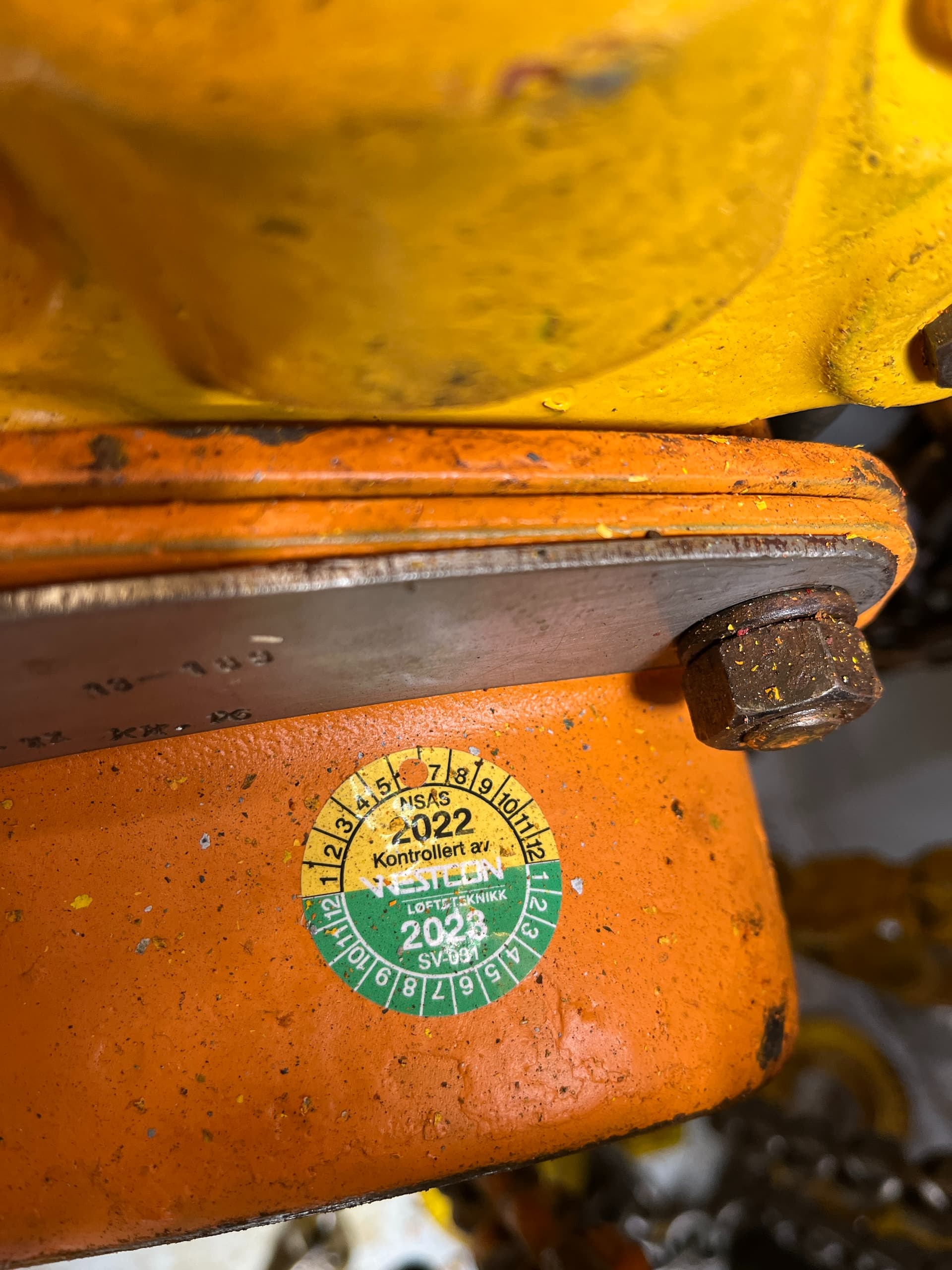
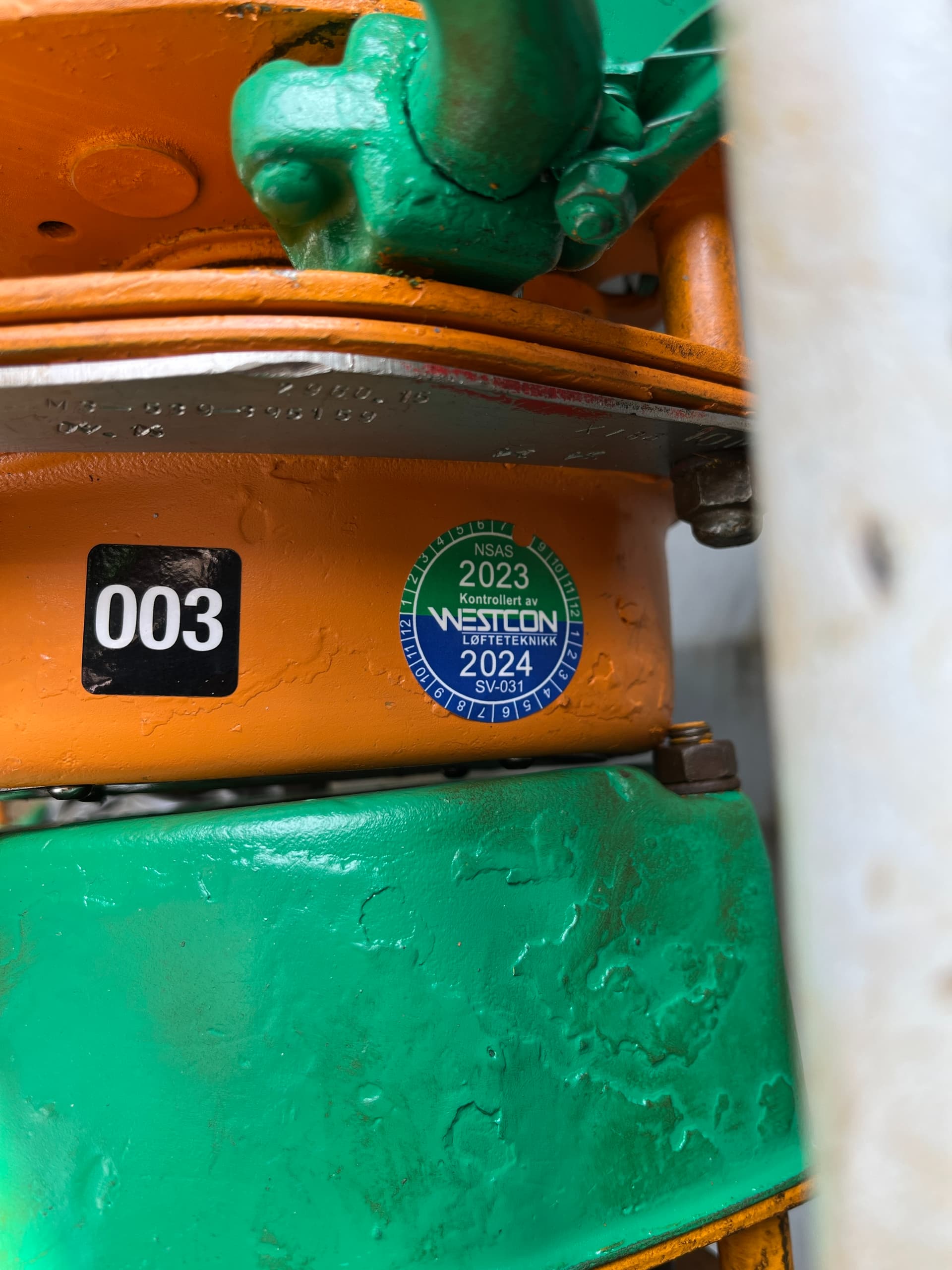
Yellow is 2022
Green is 2023
Blue will be 2024